Use Critical CSS Technique to Improve PageSpeed Score
 YC
YC- |
- 11 January 2022

CSS are usually save in a separate css file and loaded with the link tag in html. This provides many benefits including the likes of browser caching and faster delivery of content using CDN. However this causes a huge downside in your PageSpeed score which impact your SEO ranking. When your browser loads your page with separate CSS files, it must download and parse the CSS files before it can render your page. This blocks the rendering and gives your website a poor score in First Contentful Paint (FCP), which is a metric to measure good user experience. A good website should aim to have a FCP below 1.8 seconds.
To eliminate render blocking CSS files, we can make use of the critical CSS technique. This technique uses a very simple concept of inlining CSS styles that are above the fold. Styles that are below the fold can be loaded asynchronously with separate CSS files.
According to an amazing article on web.dev
Above-the-fold is all the content a viewer sees on page load, before scrolling. There is no universally defined pixel height of what is considered above the fold content since there is a myriad of devices and screen sizes.
Before page load a user will not be able to view any content below the fold, hence it is not required to immediately load any of the css that are not use by elements above the fold. These css can be deferred and not required to be loaded before the content above the fold is rendered.
In this article we are going to make use of npm module Critical to generate our critical css style. Critical make use of another popular npm module penthouse to generate the critical css. There are some benefits of using critical over penthouse to generate your critical css, and the reason below is the one that stands out for me.
Critical will automatically extract stylesheets from your HTML from which to generate critical-path CSS from, whilst other modules generally require you to specify this upfront.
Content
Installing Critical
First we have to install the critical npm package. I like yarn so we will use yarn to install our npm modules.
yarn add critical --dev
Your machine needs to have headless Chromium installed in order to generate the critical css. To install Google Chrome on WSL, you can follow this guide.
Create your critical.js and generate
Next we create a js script to generate the resulting html and css files.
const critical = require("critical");

const srcHTML = './index.html'
const dimensions = [
  {
    height: 500,
    width: 300,
  },
  {
    height: 720,
    width: 1280,
  },
];

const penthouse = {
  timeout: 60000,
};

critical.generate({
  // Inline the generated critical-path CSS
  // - true generates HTML
  // - false generates CSS
  inline: true,

  // Your base directory
  base: './',

  // HTML source file
  src: srcHTML,

  dimensions,

  // Output results to file
  target: {
    css: './css/critical.css',
    html: './index-critical.html',
    uncritical: './css/uncritical.css',
  },

  // Extract inlined styles from referenced stylesheets
  extract: true,

  penthouse,
}, (err, output) => {
  if (err) {
    console.error(err);
  } else if (output) {
    console.log('Generated critical CSS');
  }
});
Now we can run the critical.js script that we just created to generate the html and css files.
node critical.js
In this example script, the critical module takes in your specific html files and extract the critical style. It inlines the critical style into the html page index-critical.html while it bundles the rest of the uncritical style into a separate css files css/uncritical.css. The uncritical css file will be automatically link in the html page for you.
Example using popular theme
Let’s take a popular theme online and try to improve its PageSpeed score by generating critical css. In this example we will try to improve this beautiful theme Clean Blog from Start Bootstrap.
We clone and copy the dist directory into a new directory. The dist directory is the published html source and we will be generating critical css using these source code.
Next we publish the source code online to check the PageSpeed score. We use Github Pages to host our experimental example. We use both PageSpeed Insight to gather the performance scoring results on the mobile device. First let’s compare the result of the original page vs page with inline critical css.
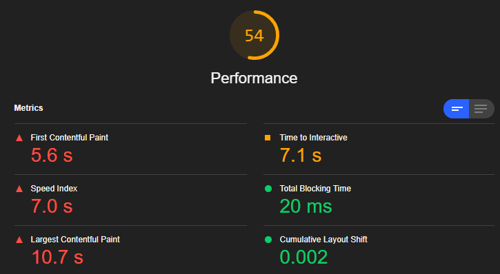
Original Page
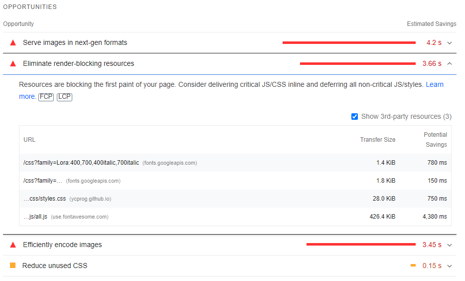
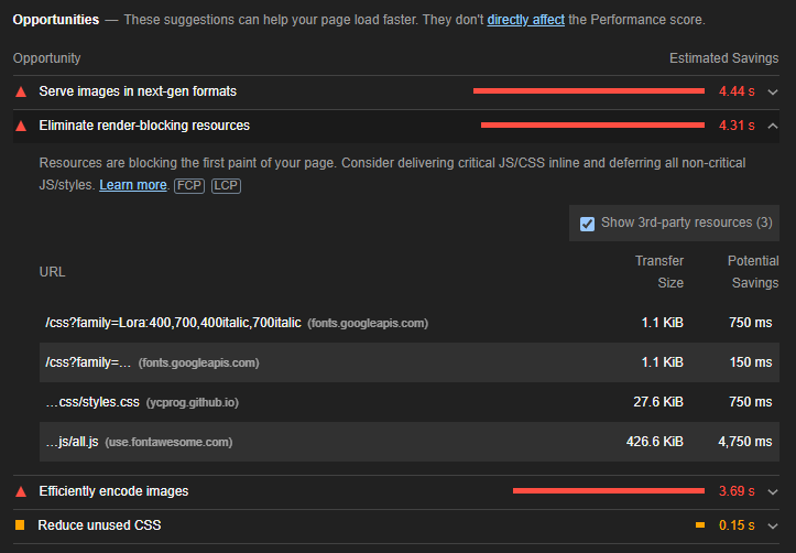
The score for the original page is not amazing. It only score a total of 54 out of 100 in performance and it has a list of render-blocking resources that took an additional 3.66s in loading time.
PageSpeed performance score of original page
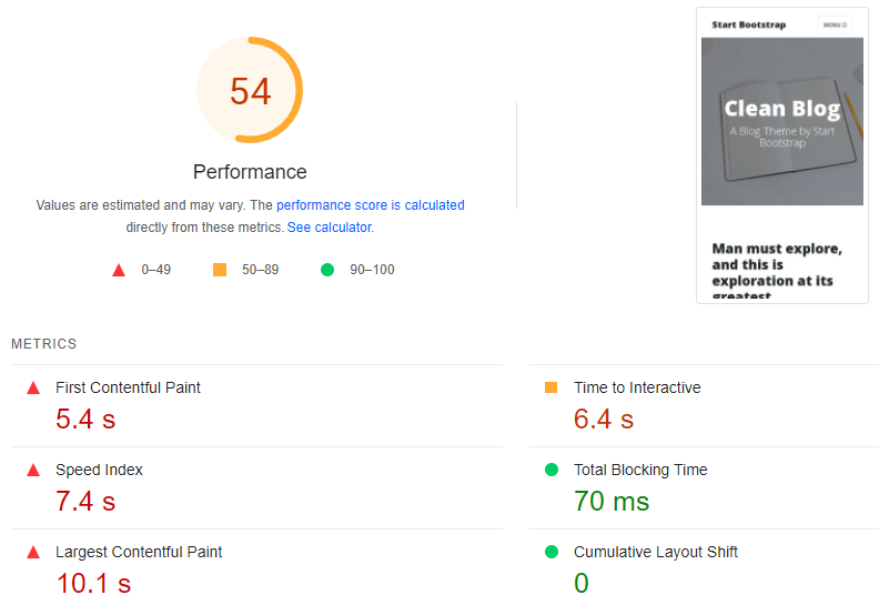
You can view the original page here.
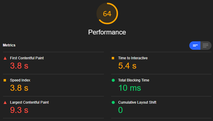
Page with Inline Critical CSS
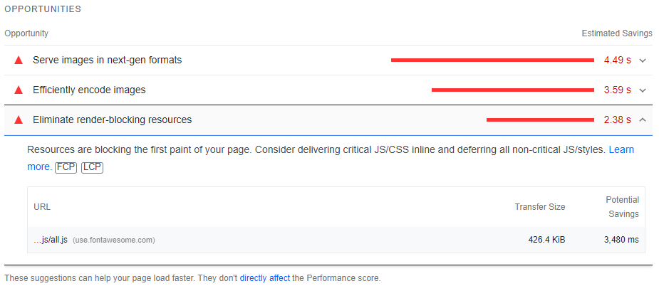
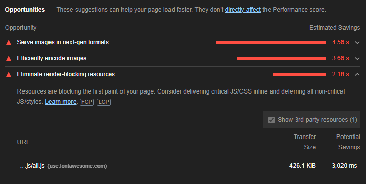
Let’s look at the score after running our critical.js script on the page. The performance score increase to 62 out of 100 and the list of render-blocking resources have been reduced. All css and fonts have been eliminated from the render-blocking list and it save a total 1.28s, bringing its additional loading time to only 2.38s.
PageSpeed performance score of page with inline critical css
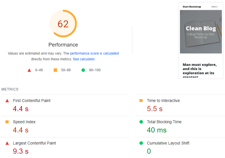
You can view the page with inline critical css here.
Running the same experiment using Lighthouse
We run the same pages using local Google Chrome Browser’s Lighthouse and received similar results.
Lighthouse performance score of original page
Lighthouse performance score of page with inline critical css
If you’re interesting in the source code, feel free to check them out at our Github repository.
Conclusion
Using inline style might not always be the best practice since inline style cannot be cache by the browser, but critical css style are relatively small in size. The tradeoff in having inline style for critical css outweighs having the css cache by the browser, and putting it in practice seems to reflect our assumption.

Written By
YC
I oversee a group of developers based in Singapore, where I professionally write code in Golang. My expertise lies in crafting highly efficient and scalable backend systems.
You May Also Like

-
YC
- 01 Sep, 2024
When a Golang nil error is not nil
Coding in Golang are usually fun and easy for developers that are new to the language. There are sometimes gotcha which will catch out even experience …
Read Article
-
YC
- 29 Jan, 2024
Crash Course on Golang Benchmarks: A Beginner's Perspective
Golang, renowned for its simplicity and efficiency, employs benchmark testing as a fundamental tool for performance evaluation. In this exploration, …
Read Article